Even if I wasn’t a graphic designer by trade, as
every author knows (whether or not they’re a best-selling one!), books are
judged by their covers, especially if it’s a bad one!
Once I’d decided on my quirky title for A
Freebooter’s Fantasy Almanac, I then had to think long and hard about how
to convey what’s in the book visually. With fantasy to the fore in the title,
this left me with a certain amount of leeway for interpreting the buccaneering
approach to imaginative reinvention… There was also the ‘real world’ aspect, in
that fantasy writing and roleplay was wonderful therapy for my recovery and
reconstruction of my true personality. Whatever made the cover had to reflect
those themes strongly.
In contrast to my earliest obsession with mythology and fantasy, real life
teaches us that good isn’t always triumphant and that the flip side of dreaming
is having nightmares. So I started to ponder on the nature of fate and the
fantastic. On how life can also take you to places you never expected, or even
wanted to go to.
Almost inevitably this led me to some illustrations
for the tarot that I’d made about 5 years ago. The ones that most equated to the prolonged and deep-seated struggle I’d had with depression,
meant that I gravitated to the images for The Hanged Man, the King of Swords,
The Hierophant or Seer, and The Tower (of Destruction) as depicted below
I concentrated on those four cards, because they
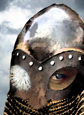
all scoped in the freebooting concept in some way (The Hierophant was inspired
by Odin, the one-eyed Allfather of Norse myth, which also has strong links to
Middle Earth). However, because I’d chosen a lighthouse and a wild seascape,
complete with white horses in the waves and Poseidon in the background for the
Tower, this literally blasted the competition out of the water with its
connotations of catastrophic events and fantasmagorical creatures! How much swash-buckling
can you take?
Typography is another of my passions. My father was
a traditional sign-writer and maker so fonts had always been on my radar, along
with paint and brushes from the moment I could hold a crayon. Because my brand
of fantasy leans very much to the gothic and often the ‘romantic’, I chose two
distinct styles to fuse together into a pleasing assemblage with the imagery, and my cover solution was complete!
If you’d like to see the
rest of the artwork for my fantasy tarot major arcana, click the link
- janowyn.deviantart.com/gallery/28530111/DreamWorlds-Gallery
 |
| All tarot cards have several meanings, but the literal fate of all thieves is the classic interpretation and so suited the piratical theming! |
 |
| The King of Swords - "A person who prefers action to reflection - above all, dramatic, decisive action." |
 |
| On Norse tarot decks, Odin is often depicted as The Seer because of his visionary aspect. |
 |
| The Tower is not always about destruction but is associated with sudden changes, usually dramatic in nature... |
For the back cover I chose a more obvious pirate image, that's continued into the book as a device to separate longer sections, and coupled that with the main title artwork.


No comments:
Post a Comment